|
A bench has two design criteria--it should be interesting to look at, and it should be comfortable to sit in. The Sizing and Measurements section explains how to make your bench fit you well. This section contains ideas on how to make your furniture appealing to the viewer, although personal taste is the most important factor. Ideas to consider are materials and finish, symmetry, proportion, complexity, and placement. |
|
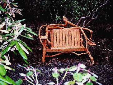
A few benches, like the one at the top of this page, are symmetrical. It faces a circular lawn, a transition from the geometry of the house and the wandering of the garden. |
Most of the furniture out in the garden looks like it is trying to be symmetrical, but doesn't quite make it, like a tree or a shrub. Natural materials lend themselves to this kind of design. Rather than have left and right mirror each other, I try to create balance. Occasionally I have tried to achieve actual as well as visual balance.
It took several tries to get the height right for the bench at the top of this page. Sitting at the edge of a 50 foot circle of lawn, the back didn't look right until it was a semi-circle starting at the top of the arms. The large double Rhododendron Bench #9 had a similar problem. When the low backs were installed, they were overpowered by the mass of the 8-foot high structure. But they were just right for a low-lying double. Arms and legs can be disproportionate too. Thickness, as well as length, should be evaluated. The Rhododendron Chair's short, heavy legs accentuate its squat appearance. The best way to achieve proportion in garden furniture is to experiment with different sizes, look at the results, and be willing to make adjustments. |
Like the contradictory tendencies in nature toward and away from symmetry, the natural world can look simple or complex depending on the level of observation. Simple and complex garden furniture designs are both appropriate if they have a purpose. In the Deodara Cedar Bench, I struggled with several styles of arms. All detracted from the simple seat and back, supported by two large chunks of the tree broken in a windstorm. The solution for the cleanest design was no arms at all. In contrast, the complexity of the cage benches or the finger bench creates the interest. Intricate lines of small branches fill the eyes. The cages enclose while the fingers lift upward. Simple and complex both work (but not in the same bench,) |
The first rule in placing garden furniture is putting it in front of something--a large shrub, a tree, a wall, or a fence. Some of the more extreme examples include the Catapult Chair and the Knob Bench. The second rule is to place the piece so you have a clear view of it from some vantage point, such as a trail. If it suddenly comes into view as you round a corner or reach a narrow vista, so much the better.
The third rule is the most obvious: place the furniture so that you have an interesting view from it. Our second Lawn Bench had a perfect framed view of Mt. Rainier, except that view also included the roof of a neighboring house. By strategically planting a large Trude Webster rhododendron and elevating the bench one foot on a mini-deck, the mountain view was improved and the extraneous details disappeared.
For more ideas on garden furnitue design, look through the 51 examples in the furniture index. Then experiment with different materials and shapes until you create something satisfying to you.